

St. Michael Medical Center is the largest hospital on the Kitsap Peninsula, sitting on a multi-building campus at 1800 NW Myhre Rd in Silverdale, Washington. Plumb Signs delivered the comprehensive interior and exterior signage program that ties that campus together — every sign a patient, family member, or clinician sees walking the corridors or driving up to the hospital.
The interior program alone runs more than 2,200 individual elements: ADA-compliant patient and room IDs, departmental and directional signage, blade markers, lobby directories, environmental graphics, and full privacy-film glazing. The exterior program is anchored by 5-foot illuminated channel letters mounted six stories up on the patient tower, a 20-foot double-faced emergency monolith at the ED entry, and a coordinated family of monuments, parking IDs, and regulatory signs across the campus drives.
Hospital signage is high-stakes work. A patient looking for the surgery center after a long drive shouldn't have to think about where to turn. A family at 2 a.m. shouldn't be hunting for the emergency entrance. Getting the system right — consistent typography, accurate ADA construction, durable illumination, brand-true graphics — is what this program was built to do.
Project Snapshot
St. Michael Medical Center
1800 NW Myhre Rd
Silverdale, WA 98383
Kitsap Peninsula · Pacific Northwest
Healthcare · Site-Wide Program
2,200+ individual sign elements
3 routed Richlite feature walls · 10+ imaging murals · 145-room privacy film · dimensional departmental letters
Tower channel letters, emergency monolith, monuments, directionals, regulatory family
Site survey · Shop drawings & CAD engineering · ADA layout · Experiential / EGD fabrication · Permitting · UL-listed fabrication · Crane & spider-staged tower install · Project management
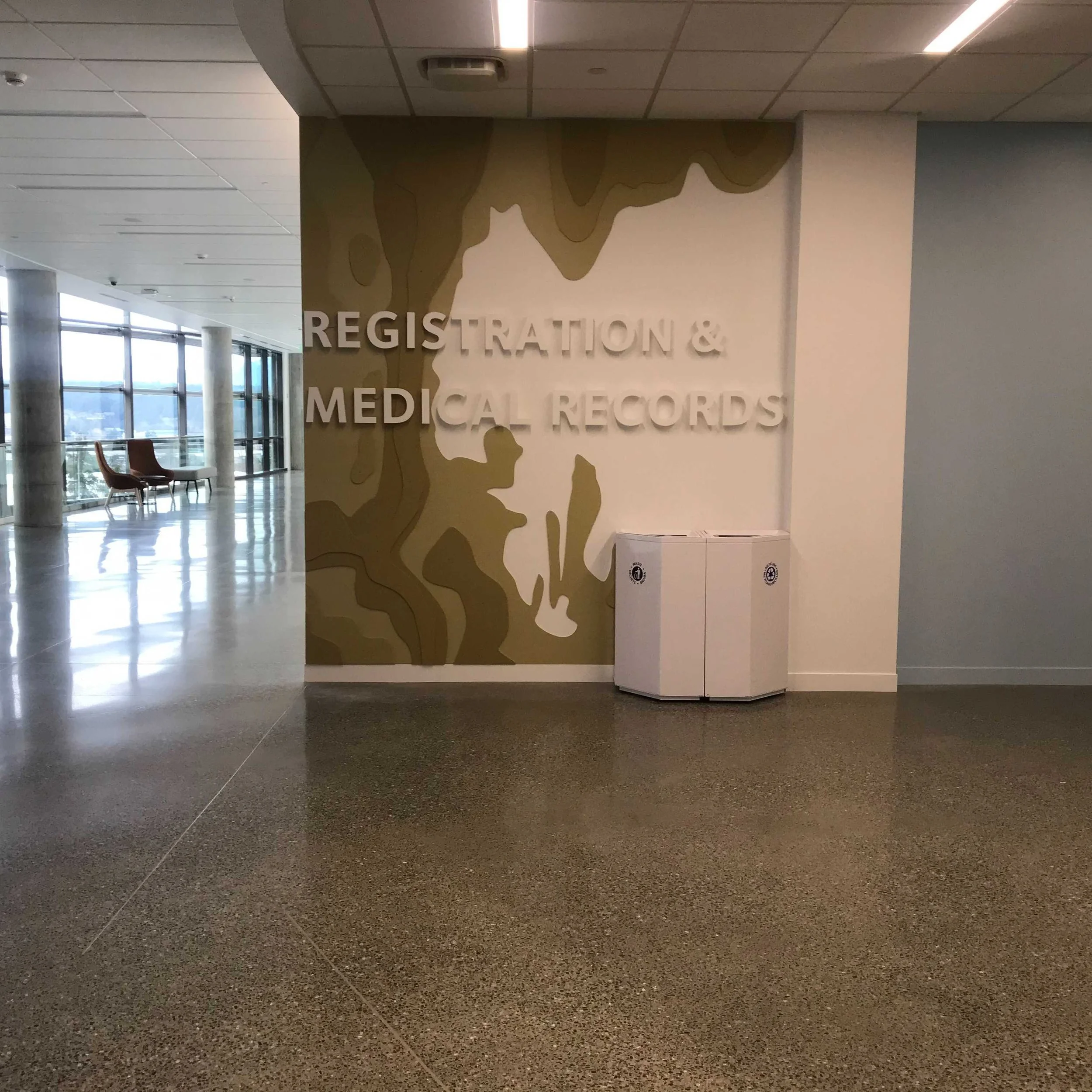
Interior Signage Program
An ADA-compliant identification and wayfinding system that scales across patient floors, clinical departments, and shared public corridors. Every interior sign is built so a first-time visitor can navigate from the front door to a specific exam room without assistance.
Wayfinding & Identification
A hierarchy of directional signage, blade markers, and wall-mounted IDs designed for consistency and accessibility. Each sign integrates Braille and tactile copy on painted acrylic, with dimensional features for visibility under varied corridor lighting.
- 1,100+ Room & Patient IDs
- 15+ Directories & Lobby Maps
- 150+ Blade Signs & Overhead Directionals
ADA & Regulatory
Compliance signage integrated seamlessly with the hospital's architectural finishes. Restroom, stairwell, and elevator signs were fabricated with raised tactile lettering, Grade 2 Braille, and photoluminescent graphics for emergency egress visibility.
- 98 Restroom IDs & Accessibility Markers
- 69 Evacuation Map Holders & Stair IDs
- 44 Stainless-Steel Elevator Plates
Patient-Floor Identification
A consistent ID system across patient floors — every room, every station, every public-facing door. Built so a clinician walking onto an unfamiliar floor reads the layout in the first ten feet.
- Painted acrylic + ADA tactile copy
- Modular insert system for room-name updates
- Coordinated typography across floors
ADA Compliance — In Detail
Every ADA element on the project — tactile copy, Grade 2 Braille, pictograms, mounting heights, finishes — was fabricated and installed against the 2010 ADA Standards for Accessible Design. Two examples from the program:


The experiential and environmental graphics layer of the interior program — feature walls, murals, privacy film, and dimensional departmental branding — is detailed in the next section.
Experiential Signage & Environmental Graphics
Experiential signage — also called environmental graphic design, or EGD — is the layer where wayfinding stops being navigation and starts being the experience of the place. In a hospital, that layer carries the weight of the brand. It's what a patient remembers from the visit.
At St. Michael Medical Center, the experiential program runs across four distinct elements that work together — each engineered as part of the architecture, not bolted on after.


The Four Elements of the St. Michael Experiential Program
Routed Richlite Feature Walls ×3
Three statement walls routed from Richlite — a paper-and-resin composite — bringing warmth and organic texture into clinical corridors. The walls anchor key public-facing destinations and read as architecture.
Imaging & CT Suite Murals 10+
Large-format digital-print wall murals coordinated with the architects to soften the clinical environment of the imaging and CT suites. Color-matched to the calming palette specified by the design team.
3M Clearview Privacy Film 145 rooms
A 145-room privacy-film program — translucent at human eye height, clear above and below — preserves patient privacy without isolating rooms from corridor light or losing the daylight architecture.
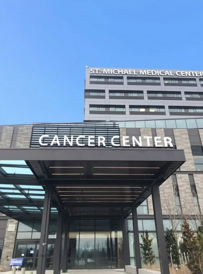
Branded Departmental Signage
Custom painted acrylic with wood-veneer returns defines major destinations — Heart & Cardiovascular, the Surgery Center, Oncology — with dimensional letterforms that read as architecture, not signage.
The point of experiential signage at a hospital isn't decoration. It's the part of the visit that signals to a patient that the place is competent, calm, and built around them.
Exterior Signage Program
The face of the hospital — engineered for visibility from the highway, durability against coastal weather, and consistent night-time identity across the campus drives. Every exterior assembly is UL-listed and built from 1/8" fabricated aluminum to withstand Puget Sound conditions.
Illuminated Channel Letters — Tower ID
The hospital's primary identity: 5-foot-tall illuminated channel letters reading "St. Michael Medical Center," mounted six stories up on the patient tower. Each letter is fabricated from painted aluminum with translucent white acrylic faces and internal LED illumination — anchored on raceways engineered to handle the wind loads at that elevation.
- 5' face-lit acrylic letterforms with LED illumination
- Precision-installed on 8' modular raceways
- Crane and spider-staged install at six-story elevation
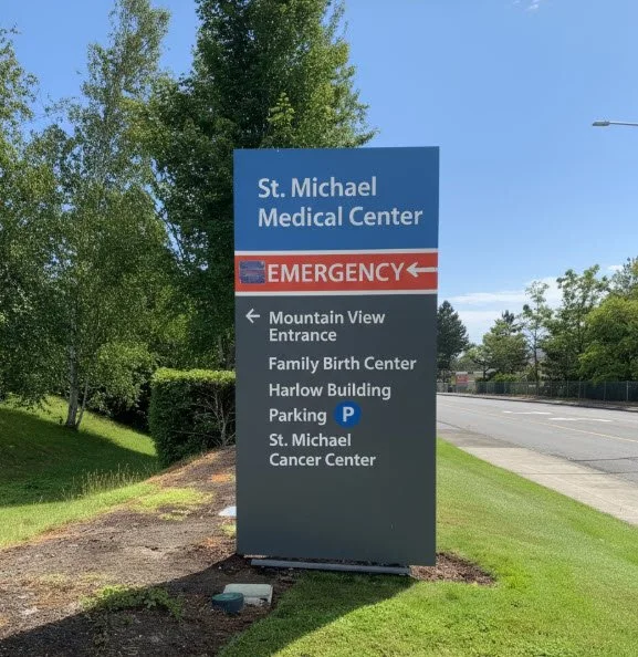
Monolith & Directional Family
A complete exterior wayfinding network — an illuminated 20-foot double-faced emergency monolith at the ED entry, vehicular directionals at every campus decision point, and a coordinated regulatory and parking program. Each aluminum cabinet integrates vinyl graphics, routed faces, and LED up-lighting for consistent night-time visibility.
- 1 Emergency monolith — 20' tall, double-faced structure
- 12 primary & 8 secondary vehicular directionals
- 82 regulatory & parking panels across the campus
Campus Illumination & Coastal Durability
From the emergency entrance to the main campus drive, every exterior sign was coordinated for uniform lighting tone and typography. Custom internal LED integration on illuminated assemblies plus below-grade up-lighting on non-illuminated cabinets — clarity and safety in any condition. All powder-coated aluminum finishes were specified for Puget Sound coastal salt air.
- Internal white LED illumination on all primary assemblies
- Below-grade up-lighting on non-illuminated cabinets
- Powder-coated aluminum finishes for coastal climate
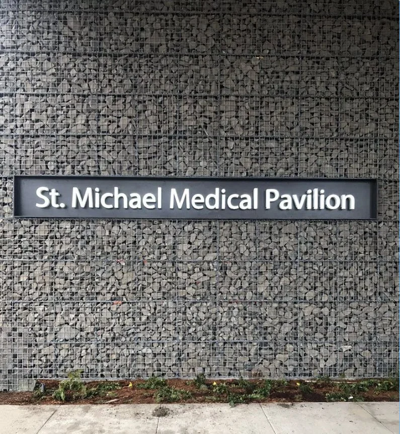
Secondary Building Identification — Pavilion ID
Not every building on a hospital campus needs the full tower-height ID. The St. Michael Medical Pavilion gets a clean, scale-appropriate illuminated cabinet mounted onto a gabion (stone-filled wire-mesh) architectural feature wall — the sign integrates with the architecture instead of fighting it.
It's a moment where signage and architecture work as one. The gabion wall is the architect's gesture; the illuminated cabinet is the building's name. Together they identify the pavilion at human scale, without competing with the main tower channel letters across the campus drive.
- Illuminated aluminum cabinet, white acrylic face
- Mechanically fastened to the gabion structural frame
- Coordinated to the tower-ID typography across the campus
Project by the Numbers
A scaled-up healthcare program — interior, exterior, and environmental — built and installed as one coordinated package.
Why Hospital Signage Is Different
Signage in a hospital isn't decoration — it's part of how care gets delivered. A patient with a wheeled walker following a directional sign to imaging, a family member trying to find Cardiac Rehab on a Sunday afternoon, an ambulance driver locating the ED bay in the rain — every sign earns its keep by removing friction from a moment that's already hard.
That's why a program at this scale gets engineered, not assembled. Cabinet construction has to last. Tactile and Braille have to meet the ADA standard exactly — wrong dot height or letter case fails an inspection and the sign comes down. LED illumination has to stay even and on-brand for the life of the assembly. Mounting hardware on the patient tower has to handle wind loads at six stories. Each of those calls was made on this project before any sign was cut.
For health systems running multi-facility brand programs, that's the case for one fabricator owning the whole chain — design, fabrication, permitting, install, service. The system stays consistent, and there's one phone number to call when something needs attention.
Fabrication Specifications
- Cabinets: 1/8" fabricated aluminum body
- Channel letters: 5' face-lit, painted aluminum returns
- Letter faces: Translucent white acrylic, internal LED
- Interior IDs: Painted acrylic, Grade 2 Braille, raised tactile copy
- Departmental letters: Painted acrylic with wood-veneer returns
- Listing: UL-listed sign assemblies
- Finish: Powder coat — coastal climate spec
- Privacy film: 3M Clearview Gradient
- Egress signs: Photoluminescent for emergency visibility
- Elevator IDs: Stainless steel ADA plates
Mounting on the patient tower used 8' modular raceways with crane and spider staging at six-story elevation. Exterior cabinets are anchored to existing concrete with stainless steel hardware. Every illuminated assembly carries a UL label.
Hospital Signage Across the Kitsap Peninsula
Plumb Signs is based in Tacoma — twelve miles east of Gig Harbor across the Tacoma Narrows Bridge, with a straight shot up Highway 16 to Silverdale. That proximity matters on a hospital program: site survey, ADA verification, mid-fab walk-throughs, permit follow-up, and multi-week install dispatch all happen without travel-day overhead. The same shop that builds the sign drives it over the bridge to set it.
We serve healthcare and commercial clients across the Kitsap Peninsula — including past and current work in Silverdale, Bremerton, Port Orchard, Poulsbo, Bainbridge Island, Gig Harbor, Kingston, and Belfair.
Frequently Asked Questions
Who fabricated and installed the signage at St. Michael Medical Center in Silverdale, WA?
How big was the St. Michael Medical Center signage program?
Are the signs ADA-compliant?
Are the illuminated signs UL-listed?
How were the 5-foot channel letters installed six stories up on the hospital tower?
Does Plumb Signs install hospital signs across the Kitsap Peninsula?
Can Plumb Signs handle a multi-facility healthcare signage program?
What's typical for a hospital-scale signage program timeline?
What is experiential signage in a hospital?
Why does experiential signage matter for healthcare?
Where is St. Michael Medical Center located?
Planning a Hospital or Healthcare Signage Program?
Plumb Signs designs, fabricates, permits, and installs hospital signage programs across the Pacific Northwest — from a single ADA package to a multi-facility brand rollout. See the full healthcare signage capabilities or start a project below.
Start Your Project