

Build Smarter, Brand Stronger
Explore Our Signage Insights
Our Resource Library brings together everything you need to plan, design, and execute signage projects with confidence. Each guide distills real-world expertise — from code compliance and material selection to installation and rollout strategy — helping you build smarter, brand stronger, and avoid costly surprises along the way.
Resources & Guides
Explore our professional insights, technical expertise, and best practices for signage design, permitting, and execution.

Planning a Signage Rollout
Step-by-step strategies for coordinating multi-site signage programs while maintaining consistency and compliance.
Read More
Design Concepts & Production Drawings
See how creative concepts become precise, permit-ready drawings through our collaborative design process.
Read More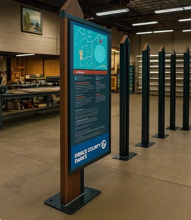
Wayfinding Design Principles
Learn how clear, cohesive wayfinding improves navigation, enhances experience, and strengthens brand trust.
Read More
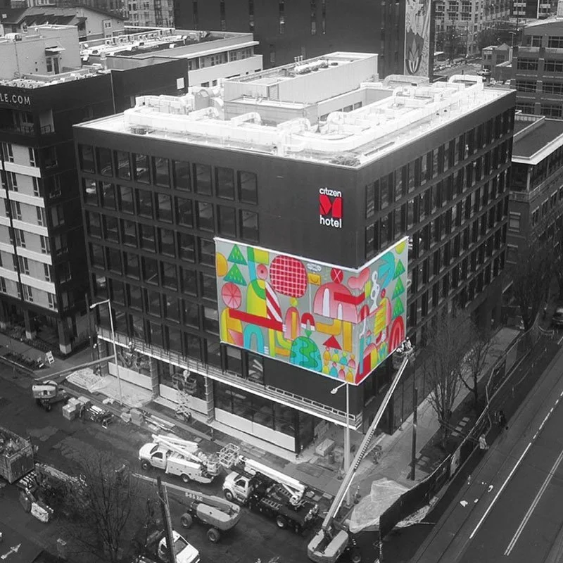
Beyond Electric Signs
Explore wall murals, interior branding, and custom prints that extend your visual identity beyond exterior signage.
Read More
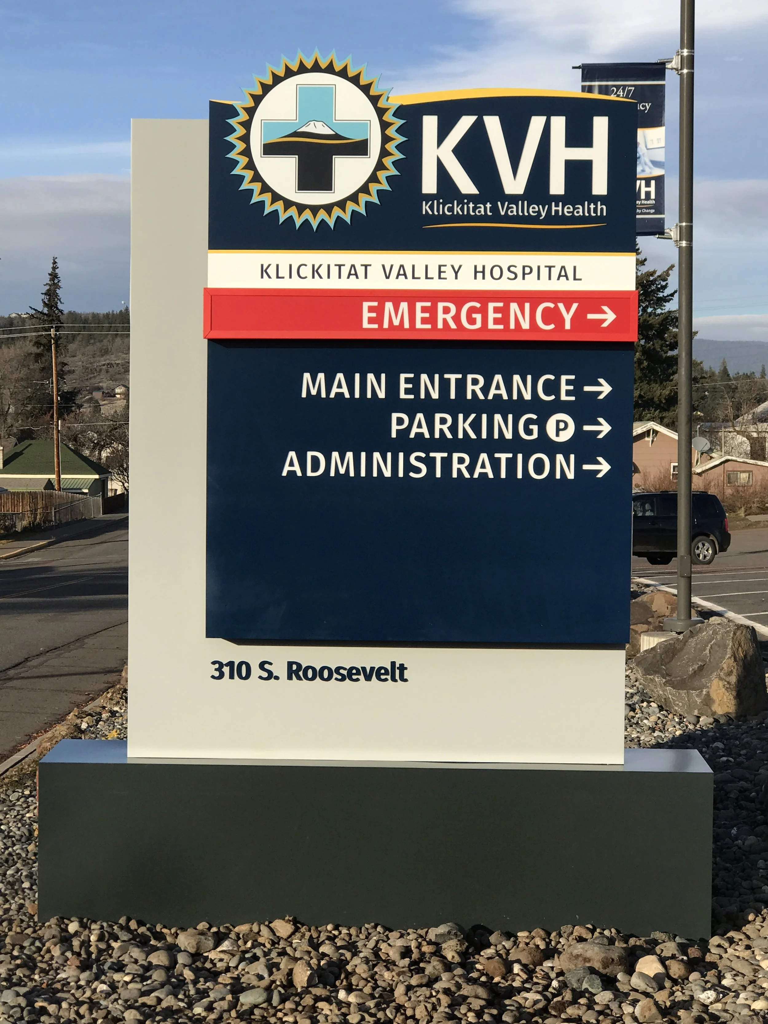
Technical Site Surveys
Why professional site surveys eliminate guesswork and set every signage project up for accurate, efficient installation.
Read More
Installation Best Practices
Ensure every signage installation meets safety, compliance, and quality standards with our field-tested process.
Read More
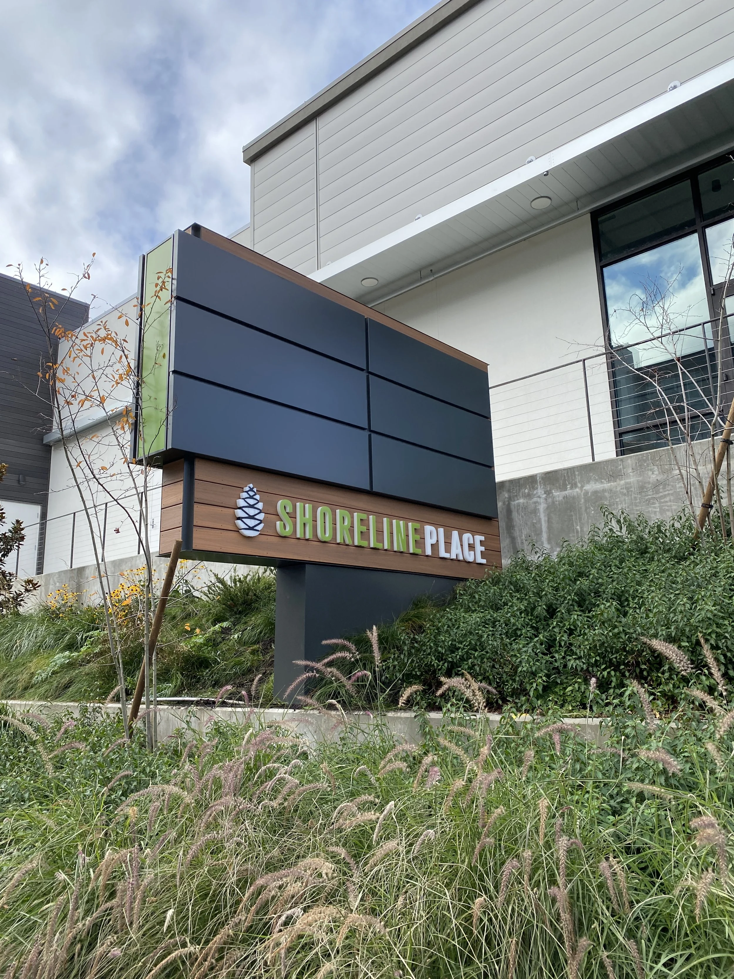
Materials & Finishes for Signage
Compare materials, finishes, and fabrication options to balance visual impact, longevity, and budget.
Read More
Signage Collaboration for Architects & Design Teams
Learn how our technical partnership helps design professionals maintain aesthetic integrity from concept to installation.
Read More
Navigating Sign Permits
Understand sign permitting timelines, documentation, and review processes to keep your project compliant and on schedule.
Read More
Sign Code 101
Discover how local sign codes impact design, fabrication, and compliance — and how to get approvals the first time.
Read More
ADA Signage & Accessibility Guide
Design inclusive, code-compliant signage that balances accessibility with aesthetics for every environment.
Read More


Ready to Start Your Next Sign Project?
You’ve explored our expert guides — now let’s put that knowledge into motion. Whether you’re planning a rebrand, a new location, or a multi-site rollout, our team is here to help you turn insight into results. Partner with Plumb Signs for expert design, fabrication, installation, and service — one trusted Washington team from concept to completion.
Start Your Project